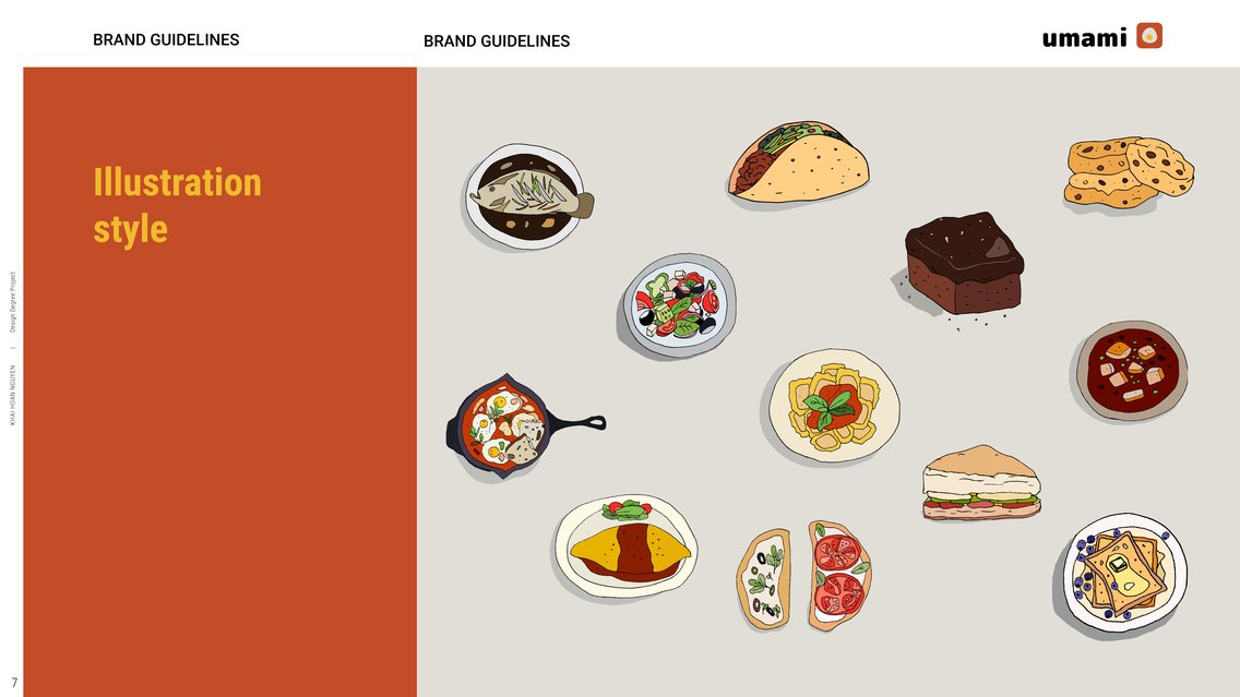
Illustration is more friendly than other graphic elements.
→ Photograph, video and texts seem conventional, sometimes it feels very professional and uncanny to recreate.
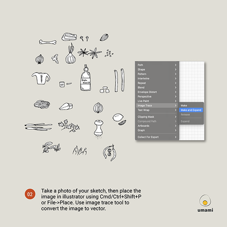
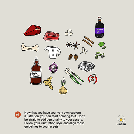
→ Hand-drawn illustrations feel warmer, approachable and authenticity.
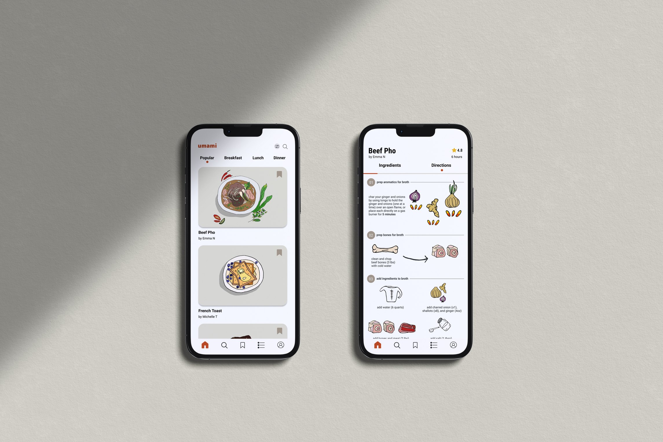
Reimagining cooking recipes with visual language
Role
Advisors
Skills
Tools
TL;DR
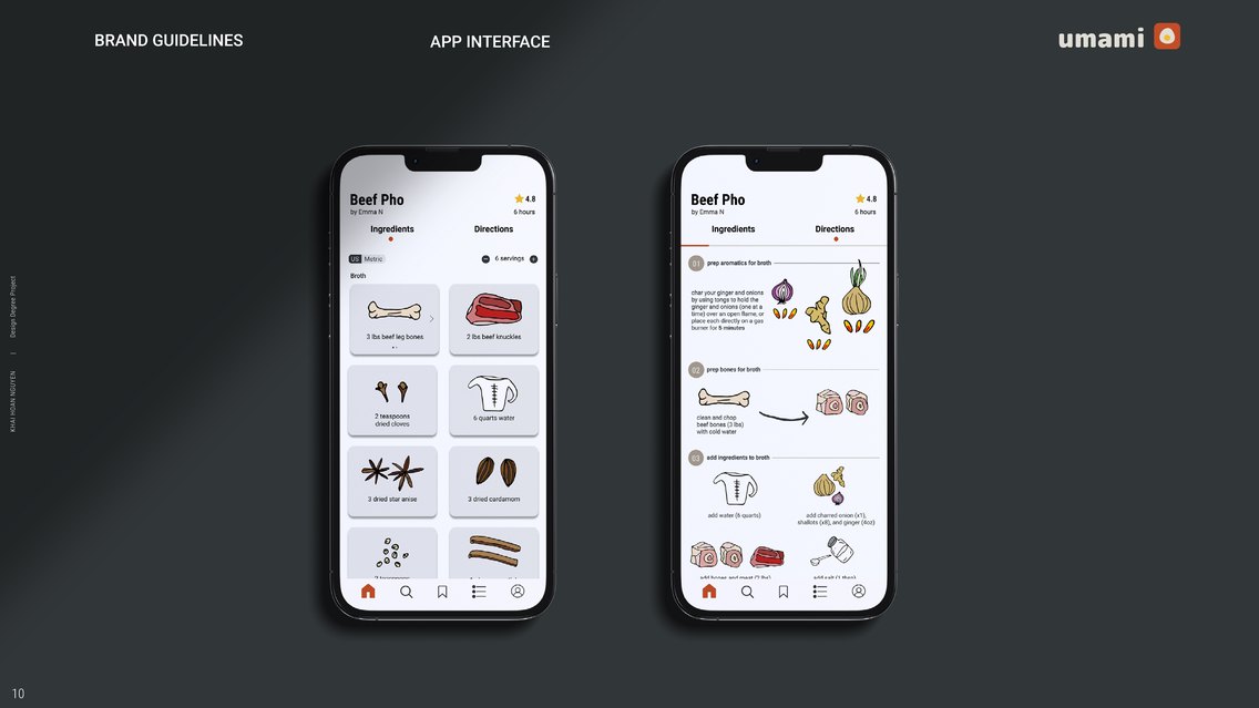
→ Umami is a mobile app that reimagines how people learn to cook, turning traditional recipes into intuitive and visual-first cooking guides.
The Problem
Through contextual inquiry and semi-structured interviews, I identified three recurring pain points with beginner chefs:
During early interviews and observations, I found that many beginner cooks weren’t struggling with cooking itself; they were struggling with how instructions were presented. They often paused, re-read, or scrolled backward multiple times. Recipes assumed a level of experience users didn’t have.
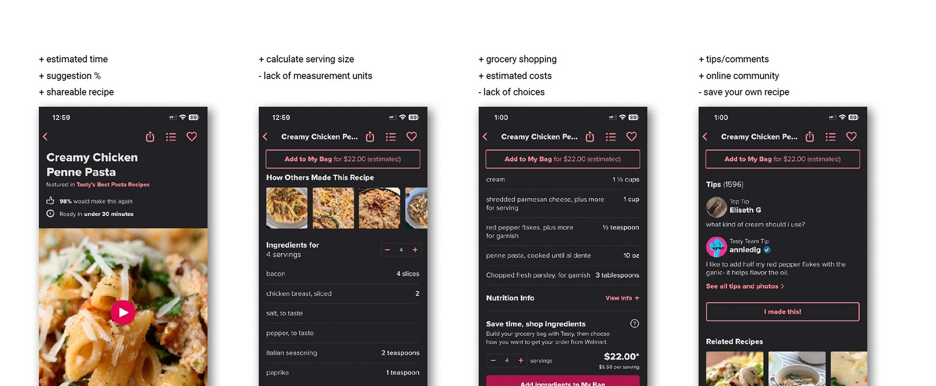
Current apps are paid subscription model and not customized to the beginners.
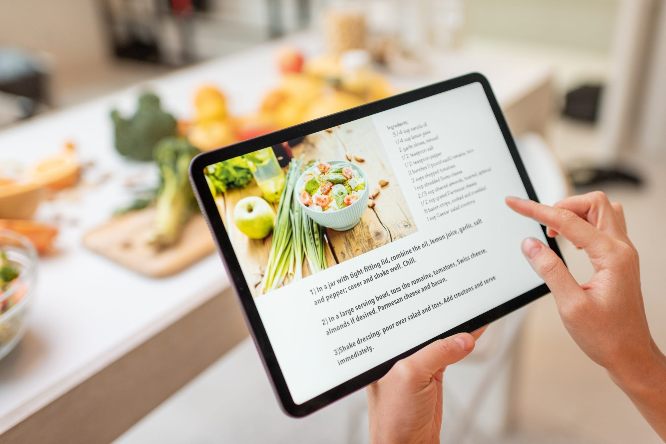
Written digital recipes are not delightful to absorb information and requires constantly touching screen.
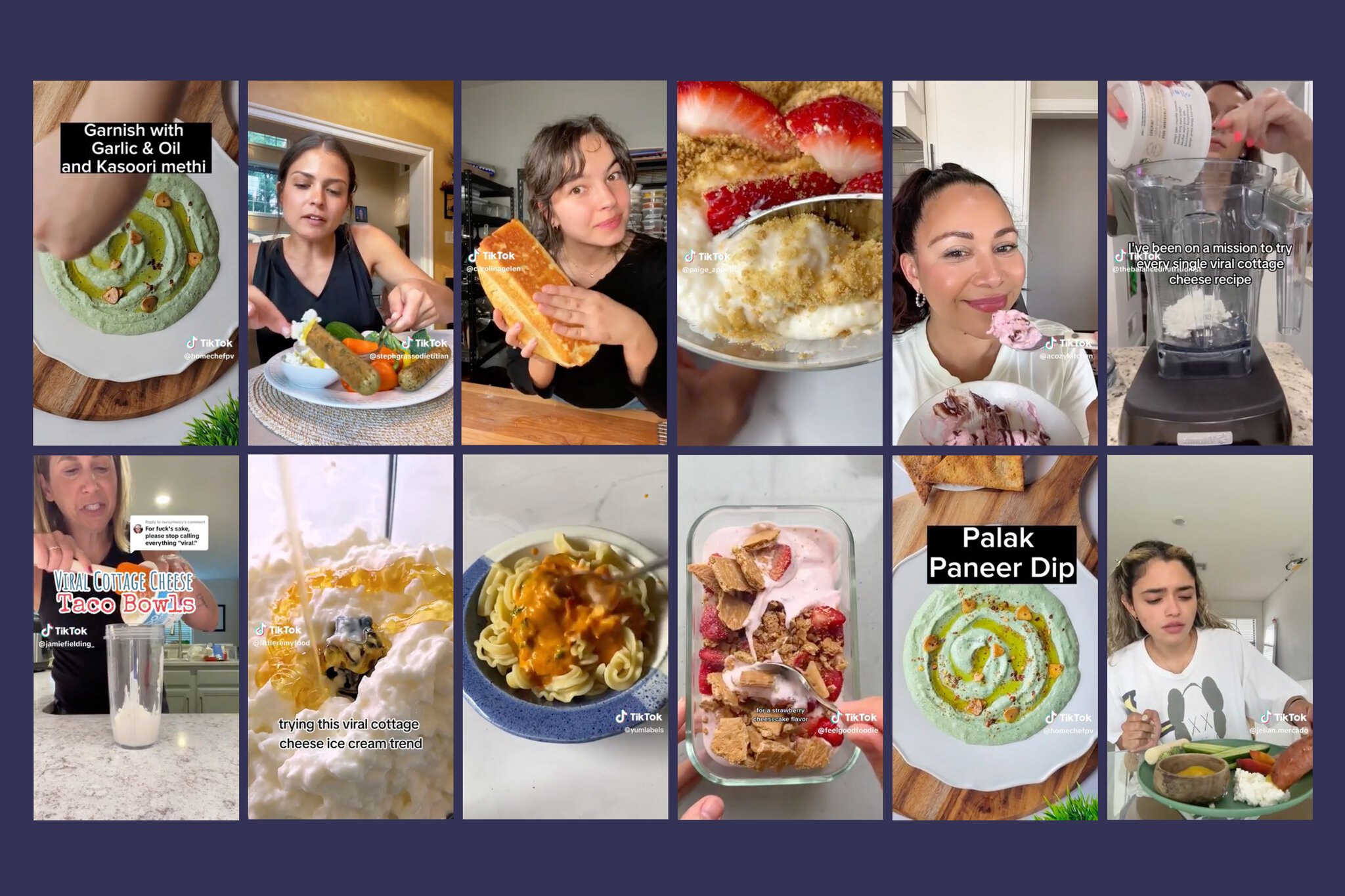
Short videos requires user to rewatch and jot down notes to keep up with the recipes.
College students often learn over the convenience of take-out orders.
Research Question
The research phrase started with the observation of the people I’m closed with experience and approach cooking at home. As a college students who are busy with study and exams, and conscious about what we eat, we constantly debate the benefits of meal prep vs. take-out.
How might we transform dense recipe content into an intuitive, visualization-first experience that empowers young adults to enjoy cooking at home?
Design Guidelines
→ Photograph, video and texts seem conventional, sometimes it feels very professional and uncanny to recreate.
→ Hand-drawn illustrations feel warmer, approachable and authenticity.
→ Mobile is always available on hand, despite having a smaller screen.
→ Using camera available, users can share photos of the food to the community.
Design Process
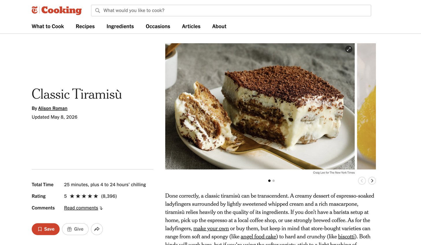
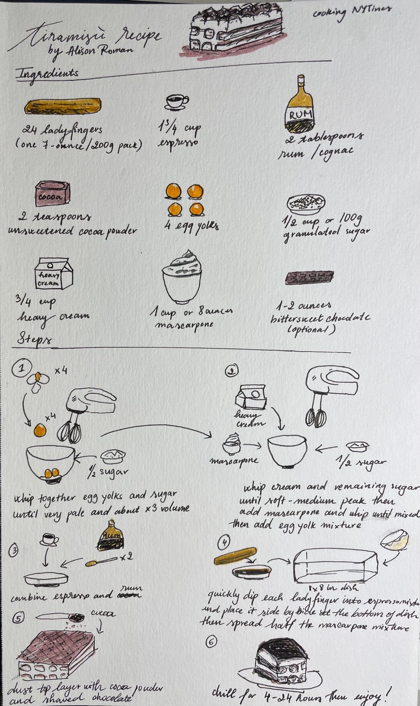
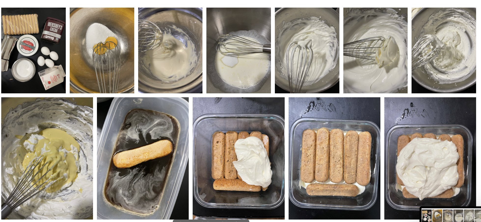
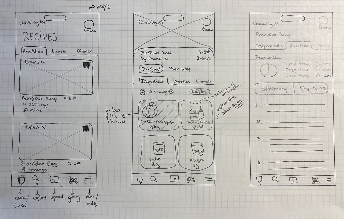
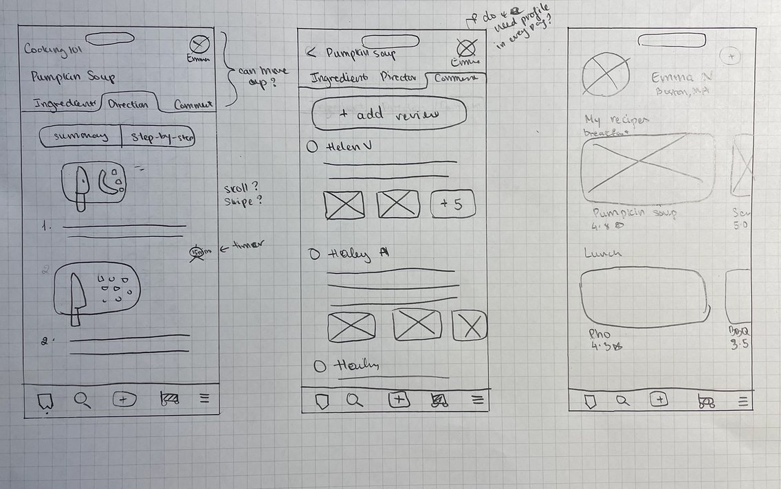
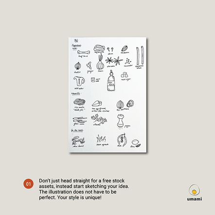
It started with a sketchbook. I hand-drew a Tiramisù recipe from The New York Times Cooking to test a simple question: Can a fun hand-drawn illustration support text in helping someone cook?
Having made the dessert before, I didn’t need to think much — I followed my own visuals, and surprisingly, it worked. It made the cooking feel lighter, more enjoyable. That became the inspiration behind umami: not just to digitize a recipe, but to redesign the way we consume information.
Personas

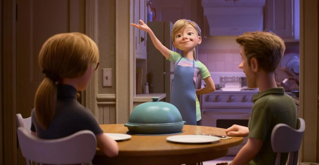
College Beginner Cook
Adapting to a massive lifestyle shift and learning adulthood.
Pain points:
Goals
Self-directed Teen
Motivated by curiosity, identity, and personal autonomy.
Pain points:
Goals
Design Guidances
Micro-animations or simple illustrations for specific techniques so they can see exactly how a technique looks without reading a definition.
Some recipes are not designed to edit the serving sizes. Thus, a dynamic scale feature that recalculates text and visual proportions for a single serving a great design feature to try out.
One biggest challenge in the observations is that users felt disrupted in the flow stage after getting paused multiple times to find the step they were at in the long list of bullet points.
Videos from influencers are professionally staged and it creates pressure for the beginners to comfortable share their progress. A small community on the app can be delightful to connect to others.
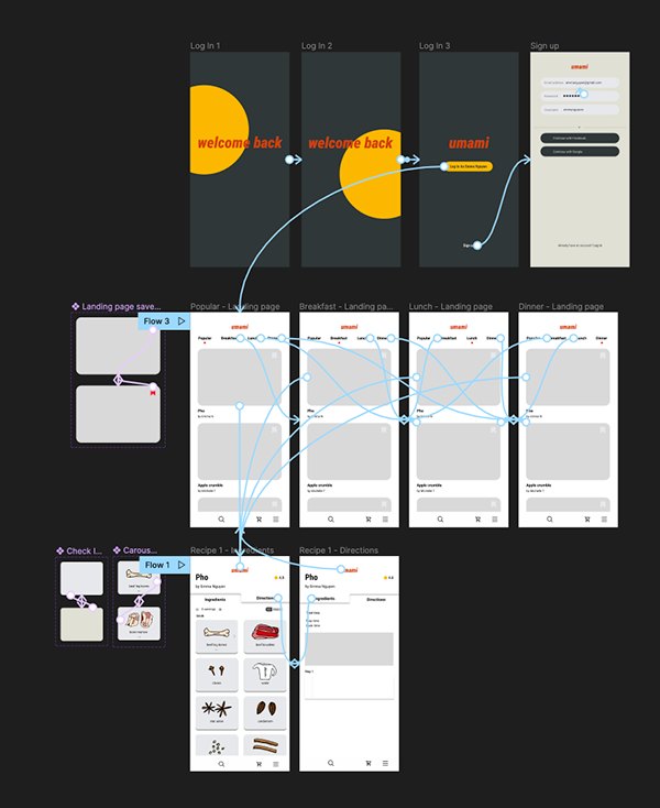
Exploration
Output
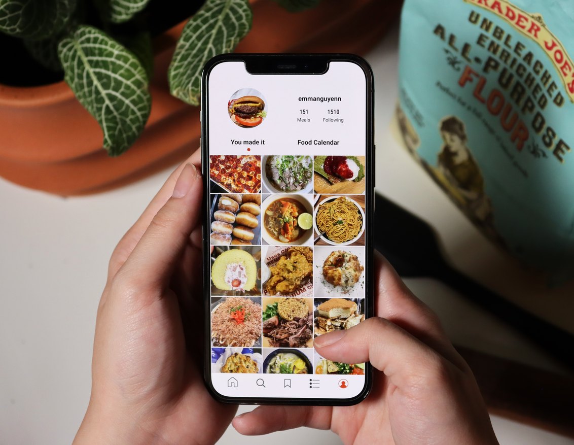
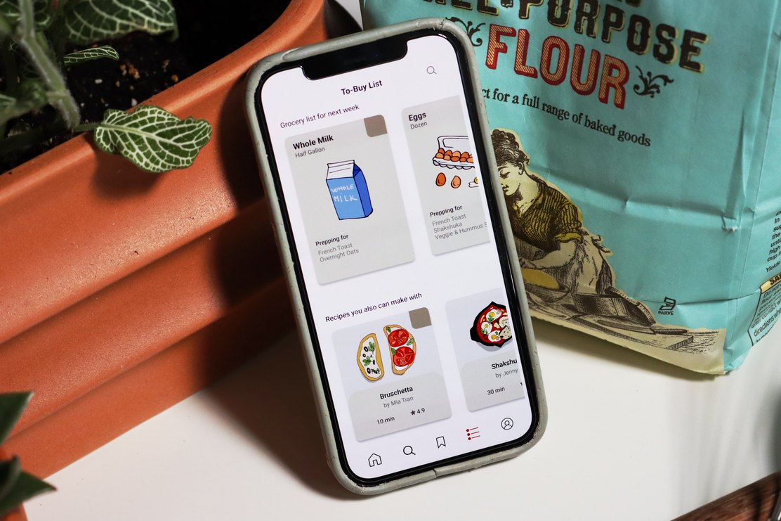
User Testing
What worked well
+ Unique illustrations made the app feel personal.
+ Interface was clean and approachable.
+ The accent color and type scale improved visual hierarchy.
+ Value-adds like measurements and history were well received.
Area of improvement
– Buttons were too small or out of thumb reach.
– Fonts needed to be more legible.
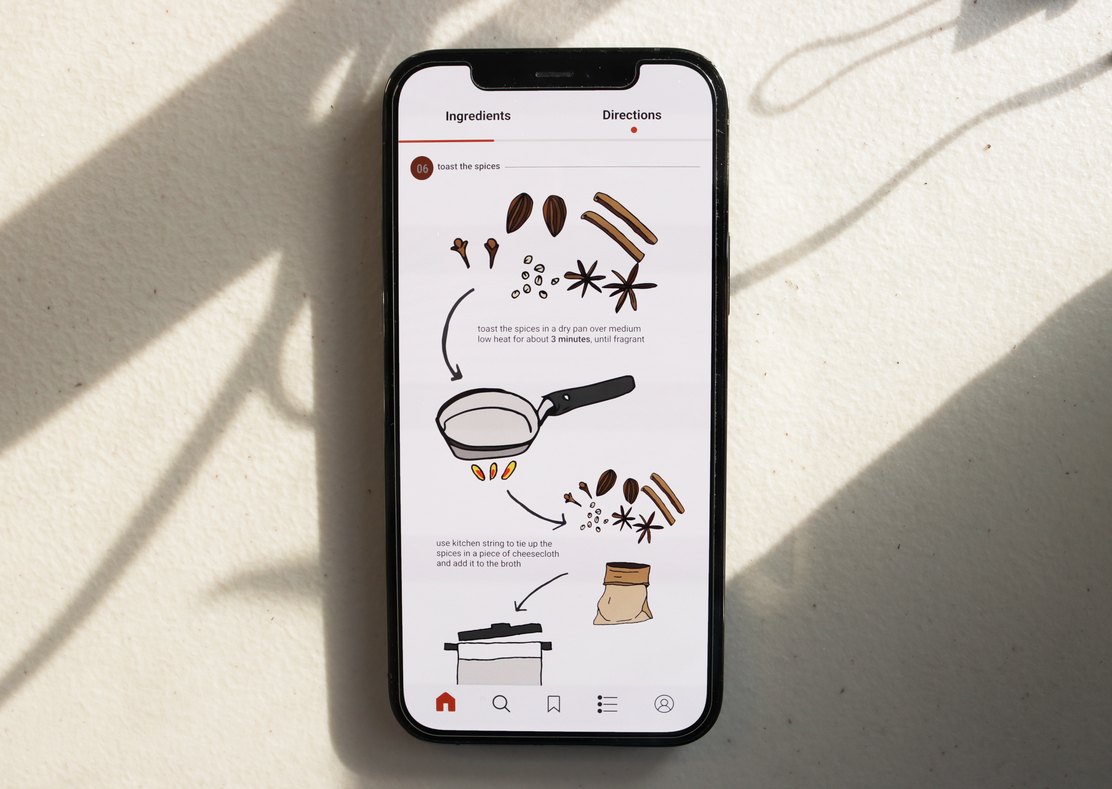
– Direction steps weren’t always easy to follow or visually separated.
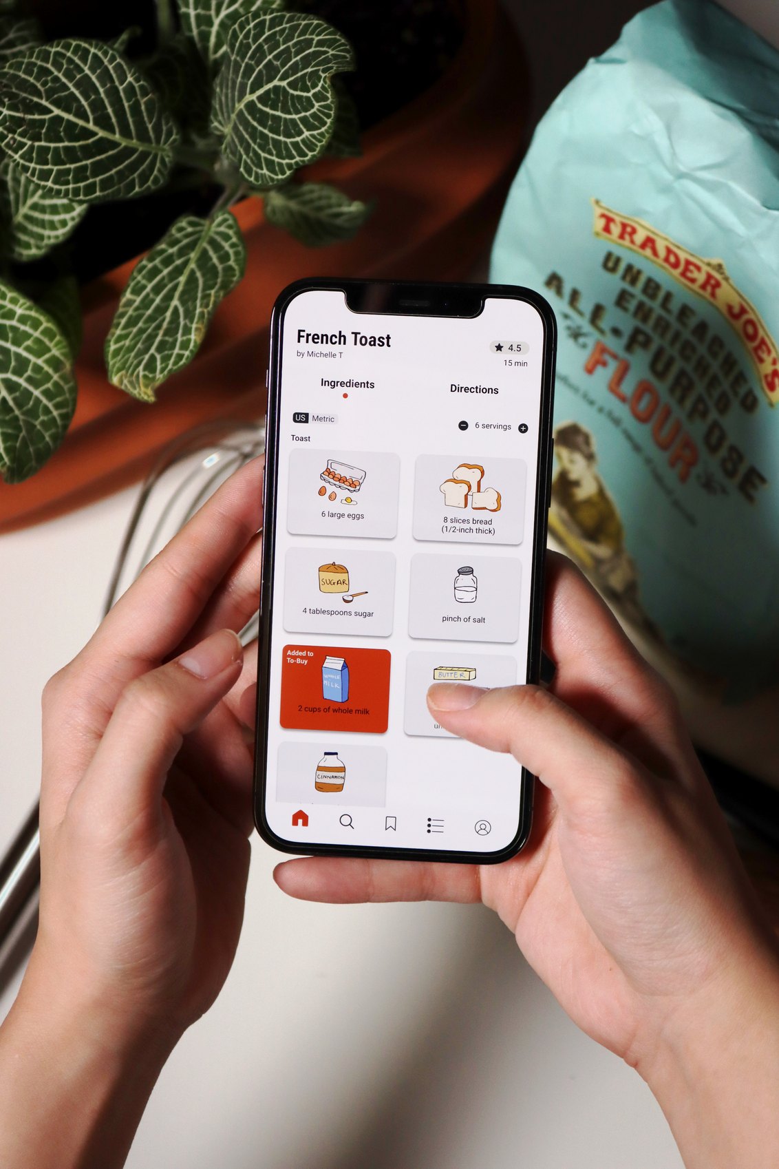
– Unclear affordances (e.g., ingredient cards confused for checklists).
I also consulted with UX/UI designers from NYT Cooking and a design director from Wellesley College.
Their guidance helped shape core improvements:
→ Use breadcrumb navigation or step indicators for better orientation
→ Consider the accessibility of text and visuals
→ Think about gesture patterns (vertical vs. horizontal scroll)
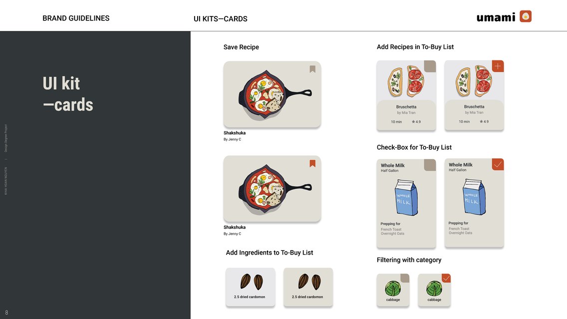
→ Clarify system feedback and visual affordances for actions like “check off” or “save”
Reflection
Initially, I set out to design and build a full app by semester’s end. That goal quickly became unrealistic. It caused burnout and stalled progress. Eventually, I reframed the scope, and the expectation, down to what I actually wanted to come away with:
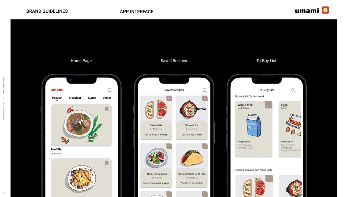
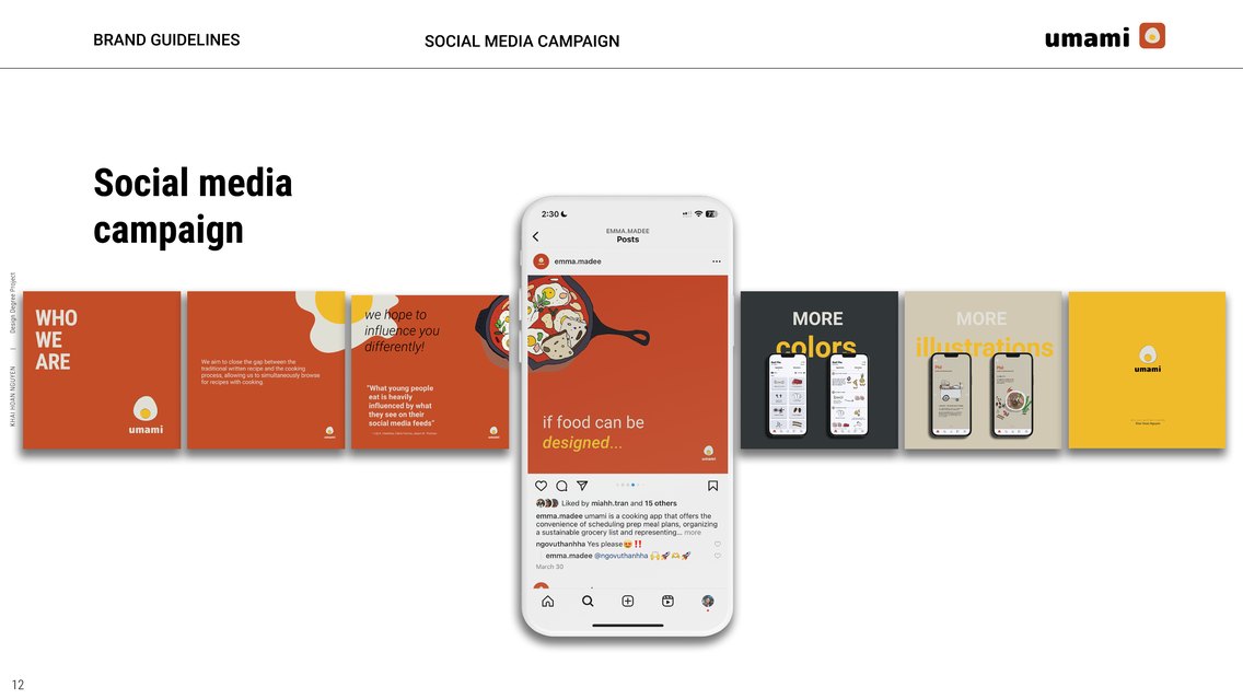
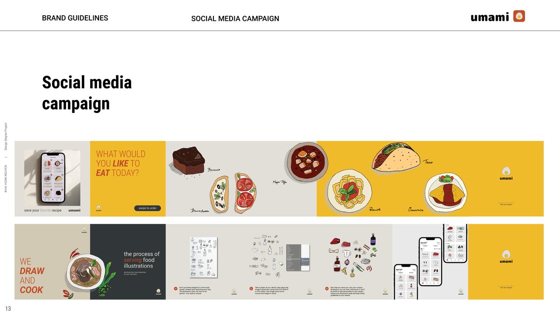
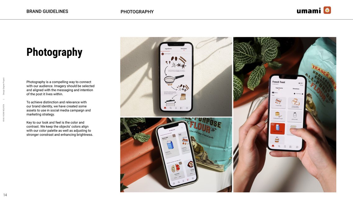
Branding